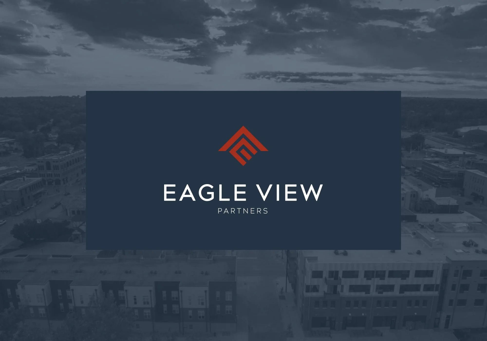
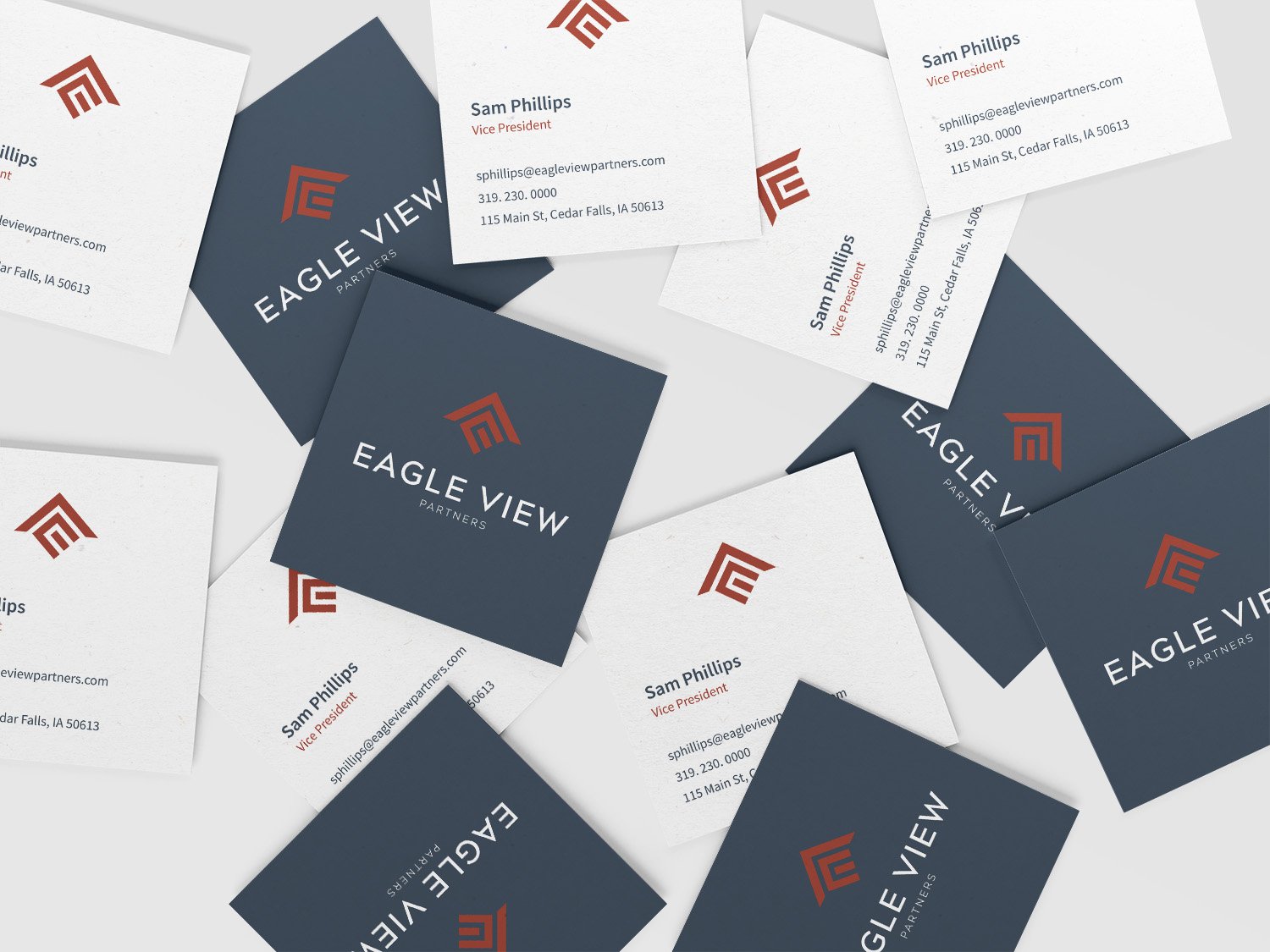
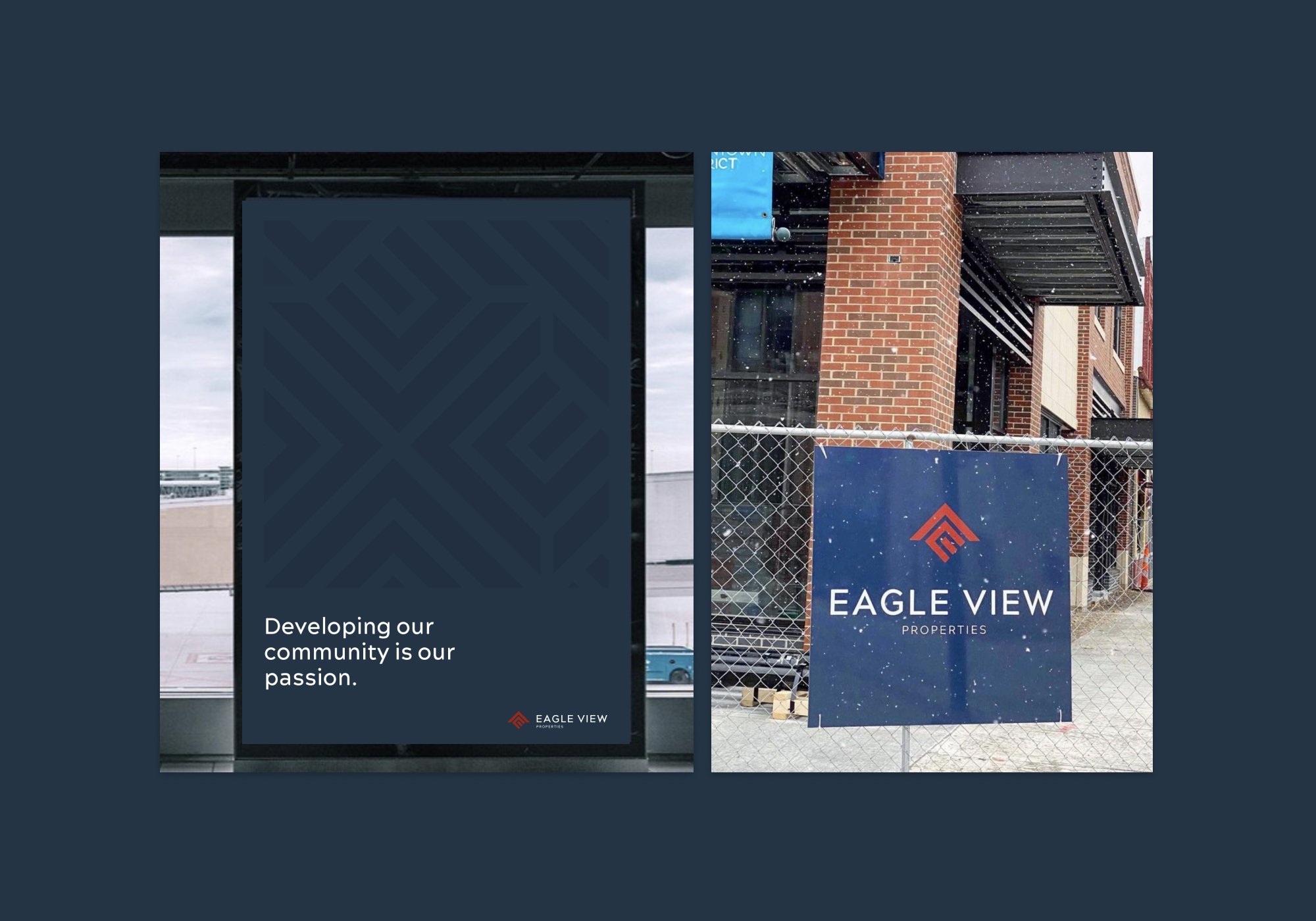
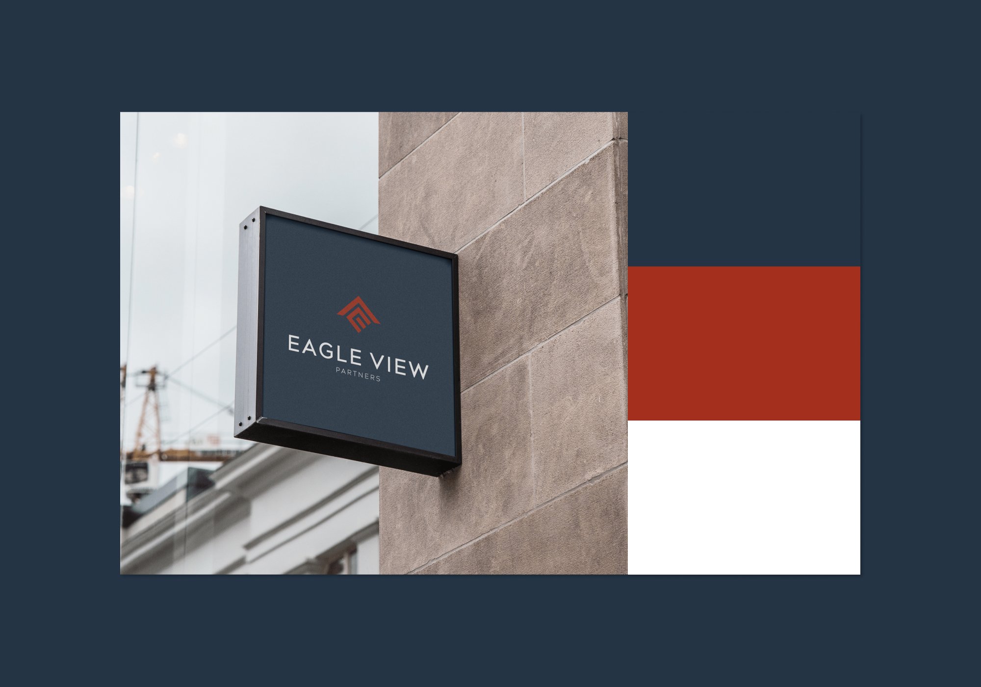
Eagle View Partners

A development parent company that housed four divisions; Development, Properties, Hospitality and Capital.

The Challenge. Creating a brandmark that would be able to adapt to the different divisions of Eagle View and was recognizable within the community.

The Brief. A mark that stood on its own without leaning too close to any of the divisions. It needed to be structural, clean professional.

The final Eagle View mark represented all of its four divisions. The structured block mark represented an aerial view of a city block, showing the different streets and plots that you would see on a development site. The E and V of Eagle View was worked into that structure to create the negative spacings. The V was inverted to point upward to represent growth. The V also represents the core priority of Eagle View was to put roofs over the heads of businesses and people within our community.

Creative Direction
Brand Strategy
Logo Design
Templated Website

Previous
Previous

No Filter Medical Aesthetics & Wellness

Next
Next

Bar Winslow